Famous for its sun, sea and scenery, Cape Town is a beloved tourist destination for visitors the world over, for this article we created a heat map analysis to observe the foot traffic mobility patterns in one of the wealthiest suburbs in South Africa.
Case Study
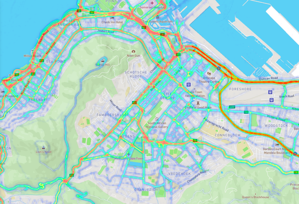
At PREDIK Data-Driven, we created a heat map based on geospatial data, in order to identify the places with the highest foot and vehicular traffic density in the famous area known as Cape Town in South Africa.

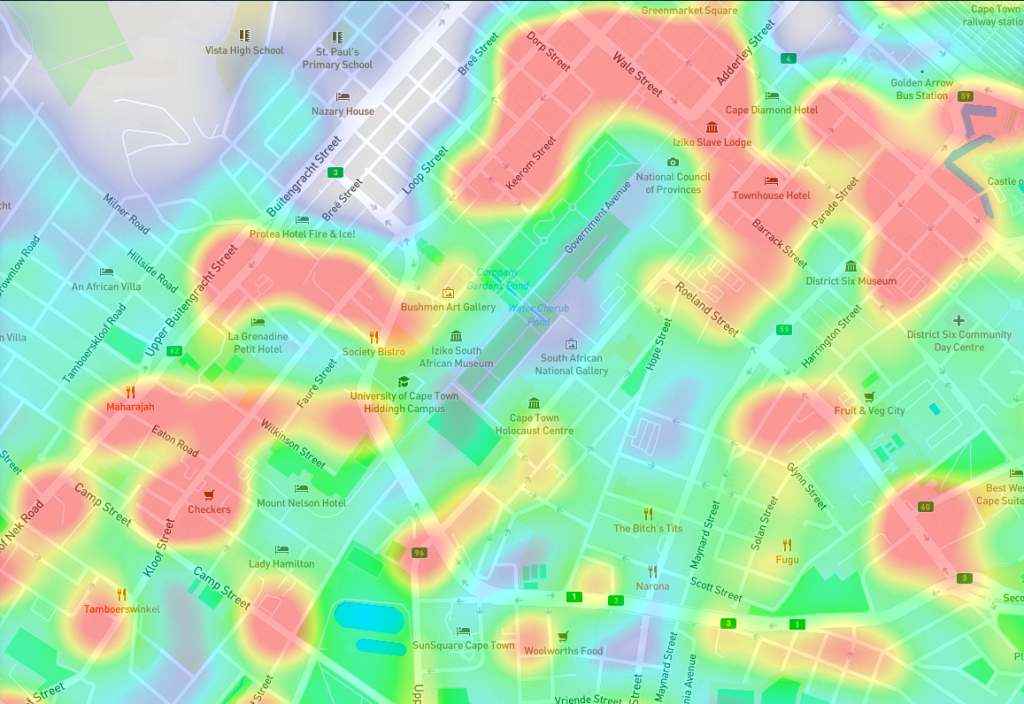
This heat map analysis shows the most frequented areas and streets in the area of interest. The colors light green, yellow and red, that are superimposed on an aerial image in a POI, shows where most and less people passed through in the month of December 2021, while being a valuable addition to the analysis arsenal of footfall figures, conversion, dwell times and average purchase times.
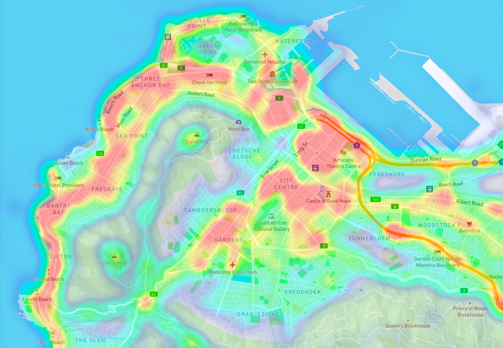
As we see in the visualization, the places with most foot traffic density in the time period analyzed were the City Centre, this was not surprising mostly because City Centre is Cape Town’s bustling commercial and business hub, with a mix of chain stores, surf stores and trendy boutiques.
Three Anchor Bay, actually the beautiful upmarket suburb almost lays claim to Signal Hill, lying as it does on the seaward side of the landmark, and its little beach is popular, particularly with sea kayakers who paddle out from Three Anchor Bay along the coast to Clifton.
Sea Point, a lively and thriving suburb where sandy beaches such as Milton and Saunder’s Rock feature tide pools, children’s play areas and sunset views. Along the coast, the Sea Point Promenade is a popular walking route. Inland, sushi bars, fast-food restaurants and pizzerias abound. Attractions at the colorful Mojo Market include African crafts, artisanal coffee and live music.
If you want to identify all of the foot traffic density distribution into detail check it out here.
With this analysis, and several calculations we can also identify the vehicular traffic into detail, this can help smart cities to implement a better urban planning program.
If you also want to identify all of the vehicular traffic density distribution into detail check it out here.
How to use the analytics generated by heat maps?
Business leaders use heat maps to decide where to place their new outlets, services and products. By answering questions such as: Where to place low-selling items in the busiest areas for sales?, What are the most and least crowded areas inside and outside my store?, Where should I put my next store?, Are we located where our customers are?, Have stores in certain areas started to outgrow others?, Is it time to open a new store?, etc.
At PREDIK Data-Driven, we can track each shopper at the scene and create summaries of their activities, such as footfall, impression and dwell time, detecting how many shoppers passed by, where they stopped, where they went and spent at any point of interest.
Like what you see? Request a Free DEMO