One of the analytical tools that leading companies use to gather knowledge is heat maps. By creating a graphical representation of their data, new insights emerge, providing companies with the information they need to adapt their strategies and maximize their profits.
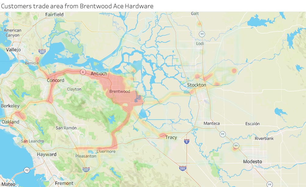
Heat maps measure the density of data in a given area. By representing density with colors, heat map data easily identifies the areas where information is most prevalent. This allows users to detect important patterns and make appropriate changes. This is why heat maps are by far the most popular way to measure the geographic density of data.
How are heat maps used in business?
Heat maps serve many different purposes in business. They are a great way to determine where data is present and where it is not, which provides companies with valuable information.
You might be interested in: “POI Analytics: Uses and Applications“
These tools are used to measure the performance of a company, a product, or an operation in a given area, generate expansion models.
Heat maps are also used for planning and strategy. This allows gaps to be filled with new locations to better serve customers. They are also an important tool for research and are perfect for measuring a wide range of demographics.
This information is important for identifying where your ideal customers are, planning marketing campaigns, and choosing new locations for your business.
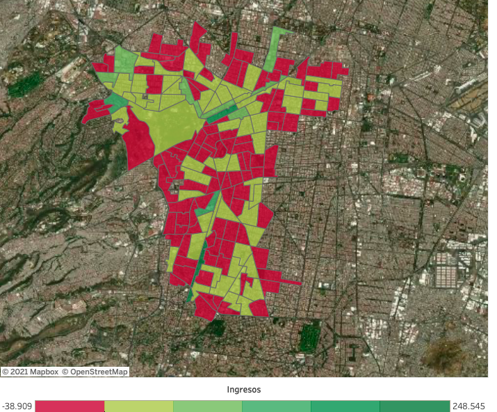
Types of Heat Maps
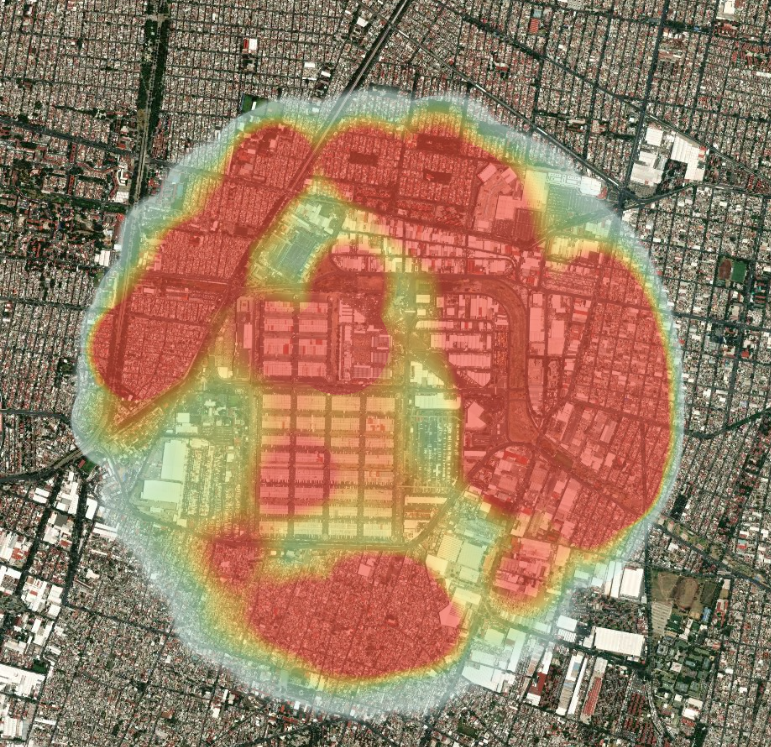
Traditional: With a traditional heat map, data points are represented as color-coded circles and given a radius of influence.
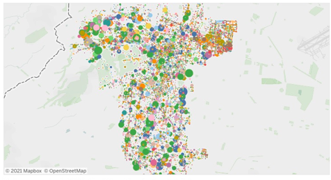
Point-based: Data are represented on the map as dots. Larger clusters represent areas of high density, and more dispersed clusters represent areas of lower density.
Area-based: You may want to compare data between different geographic areas, if that is the case, an area-based heat map is used, which gives a quick overview of the data for each region.
What type of heat map should I use?
Depending on your project, one type of heat map may be more appropriate than another. Therefore, feel free to experiment with a few different types to see which one suits your needs.
Also read: “Footfall analytics: Costco Wholesale Vs. Sam’s Club“
That said, area-based heat maps are best for comparing larger regions against each other. They are also good for comparing the performance of sales territories.
However, if you need to look at how data is distributed in a given area, a traditional or point-based heat map is best. This will identify which areas of a city or county have the most data and where data is missing.