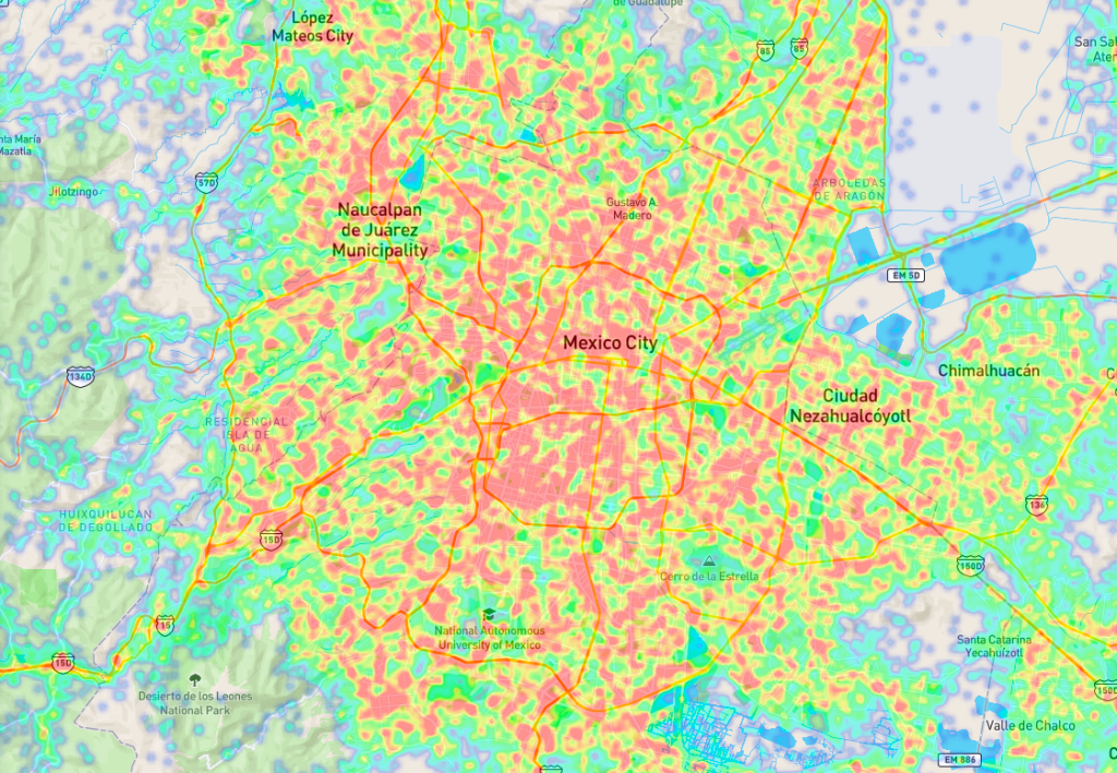
The heat map is one of the most useful and powerful data analysis tools in business intelligence. It provides a visualization feature that presents multiple pieces of data in a way that makes immediate sense by assigning a different size and color.
New geographic information systems (GIS) allow us to see our complex world in a new way. With the right data sets, heat maps can be produced that show how different factors vary from one area to another. In recent years, several organizations have developed dynamic mapping systems that allow users to choose areas, data layers, filters, and presentation features.

Main benefits of heat maps
Performance measurement: They allow you to see where you are achieving your objectives and where you are falling behind. Use them to compare company locations and territories and identify the best-performing regions.
Also read: “How to leverage heat maps to improve your business?“
Uncovering hidden trends: They allow you to visualize the data and identify trends that would otherwise have gone unnoticed.
Improve communication: They allow you to visualize with greater understanding the results obtained, and thus achieve more effective communication.
Understand your market: Heat maps are excellent for getting to know a business area better. By measuring various demographics, you will better understand who your customers are and how to attract them. You can also use heat maps to analyze potential new markets for expansion.
You may be interested in: “Footfall analytics: Costco Wholesale Vs. Sam’s Club“.
Improve your decision-making: All of the above benefits translate into a better understanding of your business. This increased knowledge allows you to make better data-driven decisions.
At PREDIK Data-Driven we generate customized visualizations so that our clients can solve or anticipate any type of problem in their business.

